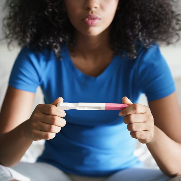
Reducing Unplanned Pregnancy Year after Year
For over 20 years, The National Campaign has been a beacon of hope for young people, shedding light on brighter futures through education and leadership. By empowering communities, informing families, and advocating for responsible policies, we’ve collaborated to create impactful resources: from marketing materials and reports to social media graphics, logos, and brochures. This legacy of knowledge and support, built together, ripples across generations.